Bootstrap Table Layout
Intro
Tables are present in most apps (web, desktop or mobile application) and they are a important component in presenting details to the final user. The HTML tables are actually used to present data in framework manner like columns and rows . With working with Bootstrap 4 framework you are able to easily increase the appearance of the table.
In the present day, with the importance that the user interface has, understanding the way to improve the visual appeal of a Bootstrap Table Title becomes as relevant as it is. In this scenario, one of the systems that have come to be reference is Bootstrap. This front-end framework, within a lot of other features , delivers a number of features for styling and optimizing the display of various elements, such as tables.
Standard table in Bootstrap
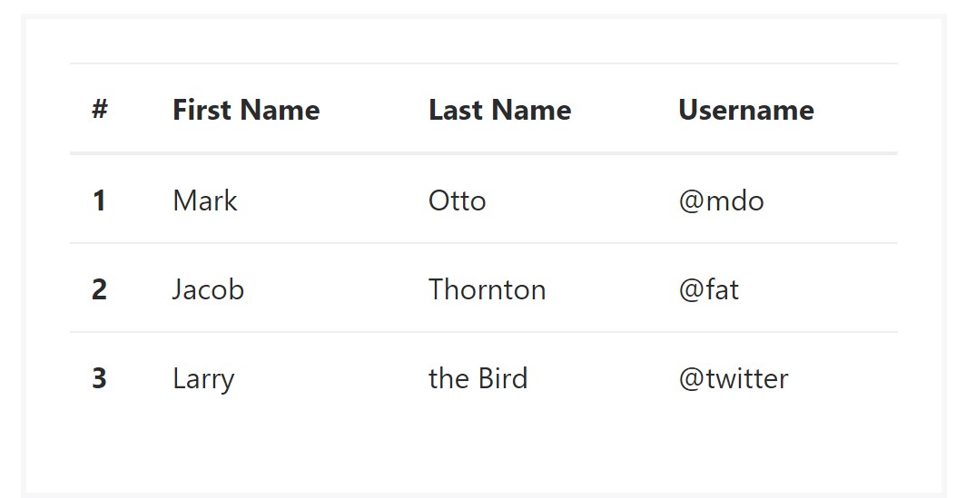
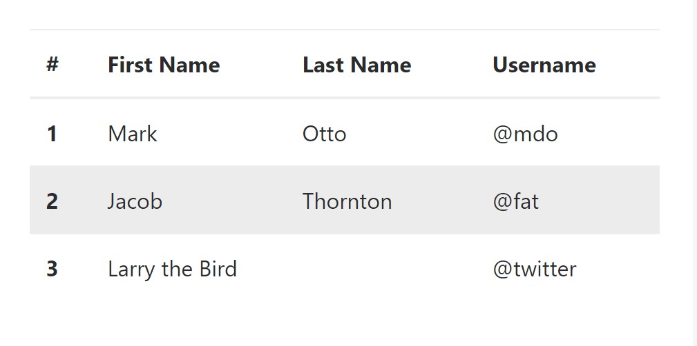
To form a table by using Bootstrap, just simply put in the table class to the <table> tag, and certain graphical formatting will already be applied , as illustrated on the screenshot .
<table class="table">
  <thead>
    <tr>
      <th>#</th>
      <th>First Name</th>
      <th>Last Name</th>
      <th>Username</th>
    </tr>
  </thead>
  <tbody>
    <tr>
      <th scope="row">1</th>
      <td>Mark</td>
      <td>Otto</td>
      <td>@mdo</td>
    </tr>
    <tr>
      <th scope="row">2</th>
      <td>Jacob</td>
      <td>Thornton</td>
      <td>@fat</td>
    </tr>
    <tr>
      <th scope="row">3</th>
      <td>Larry</td>
      <td>the Bird</td>
      <td>@twitter</td>
    </tr>
  </tbody>
</table>
Inverse tables.
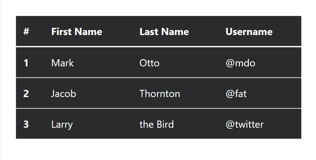
Some of the fresh tables in Bootsrap 4 is the inverse tables. Class .table-inverse can transform the colour of the table.
<table class="table table-inverse">
  <thead>
    <tr>
      <th>#</th>
      <th>First Name</th>
      <th>Last Name</th>
      <th>Username</th>
    </tr>
  </thead>
  <tbody>
    <tr>
      <th scope="row">1</th>
      <td>Mark</td>
      <td>Otto</td>
      <td>@mdo</td>
    </tr>
    <tr>
      <th scope="row">2</th>
      <td>Jacob</td>
      <td>Thornton</td>
      <td>@fat</td>
    </tr>
    <tr>
      <th scope="row">3</th>
      <td>Larry</td>
      <td>the Bird</td>
      <td>@twitter</td>
    </tr>
  </tbody>
</table>
Various other classes
For tables there are also some classes that allow you to use various looks to a table, they are:
● table-striped Toggles the color of table rows;
● table-bordered Adds border to table;
● table-hover Activates the highlight of a Bootstrap Table Editable line when we hover the mouse cursor over it;
● table-condensed Reduces the height of table rows, making it more compact.
To apply these looks, just simply add in the chosen classes to the: <table>: <table class="table table-striped table-bordered table-condensed table-hover">
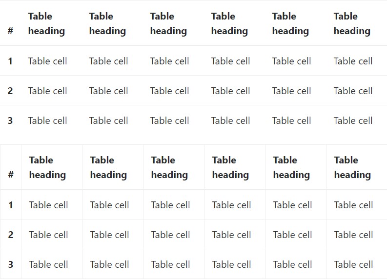
Table head opportunities
Much like default and inverted tables, use one of two modifier classes to get <thead> appear dark or light gray.
img
<table class="table">
  <thead class="thead-inverse">
    <tr>
      <th>#</th>
      <th>First Name</th>
      <th>Last Name</th>
      <th>Username</th>
    </tr>
  </thead>
  <tbody>
    <tr>
      <th scope="row">1</th>
      <td>Mark</td>
      <td>Otto</td>
      <td>@mdo</td>
    </tr>
    <tr>
      <th scope="row">2</th>
      <td>Jacob</td>
      <td>Thornton</td>
      <td>@fat</td>
    </tr>
    <tr>
      <th scope="row">3</th>
      <td>Larry</td>
      <td>the Bird</td>
      <td>@twitter</td>
    </tr>
  </tbody>
</table>

<table class="table">
  <thead class="thead-default">
    <tr>
      <th>#</th>
      <th>First Name</th>
      <th>Last Name</th>
      <th>Username</th>
    </tr>
  </thead>
  <tbody>
    <tr>
      <th scope="row">1</th>
      <td>Mark</td>
      <td>Otto</td>
      <td>@mdo</td>
    </tr>
    <tr>
      <th scope="row">2</th>
      <td>Jacob</td>
      <td>Thornton</td>
      <td>@fat</td>
    </tr>
    <tr>
      <th scope="row">3</th>
      <td>Larry</td>
      <td>the Bird</td>
      <td>@twitter</td>
    </tr>
  </tbody>
</table>
Striped rows
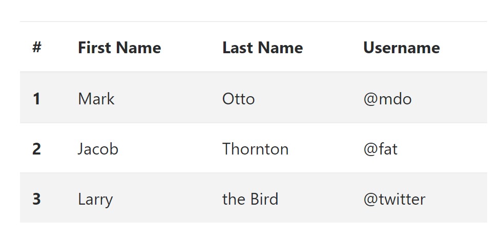
Zebra-like stripes can be added with the .table-striped class, an good example
<table class="table table-striped">
<thead>
<tr>
<th>#</th>
<th>First Name</th>
<th>Last Name</th>
<th>Username</th>
</tr>
</thead>
<tbody>
<tr>
<th scope="row">1</th>
<td>Mark</td>
<td>Otto</td>
<td>@mdo</td>
</tr>
<tr>
<th scope="row">2</th>
<td>Jacob</td>
<td>Thornton</td>
<td>@fat</td>
</tr>
<tr>
<th scope="row">3</th>
<td>Larry</td>
<td>the Bird</td>
<td>@twitter</td>
</tr>
</tbody>
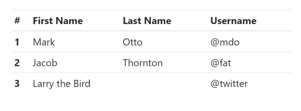
</table>Hover Rows
To create a hover effect in the rows of your table put in the .table-hover class:
<table class="table table-hover">
<thead>
<tr>
<th>#</th>
<th>First Name</th>
<th>Last Name</th>
<th>Username</th>
</tr>
</thead>
<tbody>
<tr>
<th scope="row">1</th>
<td>Mark</td>
<td>Otto</td>
<td>@mdo</td>
</tr>
<tr>
<th scope="row">2</th>
<td>Jacob</td>
<td>Thornton</td>
<td>@fat</td>
</tr>
<tr>
<th scope="row">3</th>
<td colspan="2">Larry the Bird</td>
<td>@twitter</td>
</tr>
</tbody>
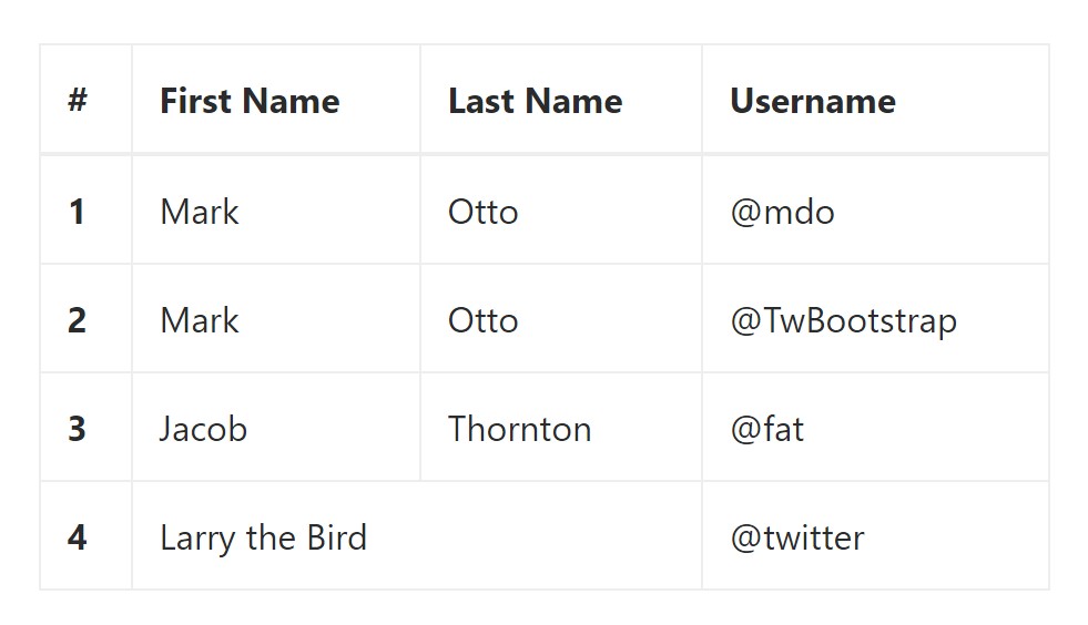
</table>Bordered Table
You can bring in the borders on each table slide and a cell by having the .table-bordered class:
<table class="table table-bordered">
  <thead>
    <tr>
      <th>#</th>
      <th>First Name</th>
      <th>Last Name</th>
      <th>Username</th>
    </tr>
  </thead>
  <tbody>
    <tr>
      <th scope="row">1</th>
      <td>Mark</td>
      <td>Otto</td>
      <td>@mdo</td>
    </tr>
    <tr>
      <th scope="row">2</th>
      <td>Mark</td>
      <td>Otto</td>
      <td>@TwBootstrap</td>
    </tr>
    <tr>
      <th scope="row">3</th>
      <td>Jacob</td>
      <td>Thornton</td>
      <td>@fat</td>
    </tr>
    <tr>
      <th scope="row">4</th>
      <td colspan="2">Larry the Bird</td>
      <td>@twitter</td>
    </tr>
  </tbody>
</table>
Condensed Table
When you intend to make your table more small - on that occasion you can easily cut cell padding in half by having this class: .table-condensed.
Take note that, while Bootstrap 4 uses .table-sm to condense a table, Bootstrap 3 uses .table-condensed. Each cut cell padding in half.
<table class="table table-sm">
  <thead>
    <tr>
      <th>#</th>
      <th>First Name</th>
      <th>Last Name</th>
      <th>Username</th>
    </tr>
  </thead>
  <tbody>
    <tr>
      <th scope="row">1</th>
      <td>Mark</td>
      <td>Otto</td>
      <td>@mdo</td>
    </tr>
    <tr>
      <th scope="row">2</th>
      <td>Jacob</td>
      <td>Thornton</td>
      <td>@fat</td>
    </tr>
    <tr>
      <th scope="row">3</th>
      <td colspan="2">Larry the Bird</td>
      <td>@twitter</td>
    </tr>
  </tbody>
</table>
Contextual Classes of Bootstrap Tables Nested
Use the contextual classes to color a table cells (<td>) and table rows (<tr>):
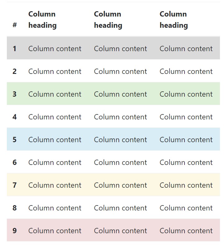
<!-- On rows -->
<tr class="table-active">...</tr>
<tr class="table-success">...</tr>
<tr class="table-warning">...</tr>
<tr class="table-danger">...</tr>
<tr class="table-info">...</tr>

<!-- On cells (`td` or `th`) -->
<tr>
  <td class="table-active">...</td>
  <td class="table-success">...</td>
  <td class="table-warning">...</td>
  <td class="table-danger">...</td>
  <td class="table-info">...</td>
</tr>
Changing the rows of a table Bootstrap 3 doesn't make use of the .table- prefix for its contextual classes. For an example, Bootstrap 3 uses .active whereas Bootstrap 4 uses .table-active. Other than that, both of these versions use the same 5 contextual key words (active, success, info, warning, danger). Listed here you are able to view the explanation about each and every one practical option:
● active: Adds the focus color to the table row or table cell
● success: Indicates a successful or positive action
● info: Indicates a neutral information change or action
● warning: Displays a notice that you might need care
● danger: Signifies a potentially negative or dangerous action
Responsive Tables
To create a responsive table - use the .table-responsive class. Table rolls in the horizontal direction on devices that under 768px. If the gadget is larger than 768px wide, then you will see no difference :
Bootstrap 4 allows you to add the .table-responsive class to the actual <table> element. Bootstrap 3 tables required that you add that class to a parent <div> element.
Review a number of online video short training regarding Bootstrap 4 tables
Related topics:
Bootstrap tables authoritative records
W3schools:Bootstrap table tutorial
Bootstrap Tables Lecture