Bootstrap Button - Group, Classes, Examples, Advanced Tricks
Bootstrap 4 Buttons Tutorials
The button elements along with the links wrapped inside them are probably one of the most significant features allowing the users to interact with the web pages and take various actions and move from one web page to some other. Specially now in the mobile first world when at least half of the pages are being observed from small-sized touch screen devices the large convenient rectangle zones on display screen very easy to find with your eyes and touch with your finger are even more important than ever. That's reasons why the brand new Bootstrap 4 framework progressed delivering more comfortable experience giving up the extra small button size and adding in some more free space around the button's subtitles making them even more easy and legible to make use of. A small touch bring in a lot to the friendlier appeals of the brand-new Bootstrap Buttons On are also just a little more rounded corners which along with the more free space around helping make the buttons a lot more satisfying for the eye.
The semantic classes of Bootstrap Buttons Animation
Here in this version that have the same variety of awesome and easy to use semantic styles bringing the capability to relay definition to the buttons we use with simply incorporating a special class.
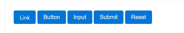
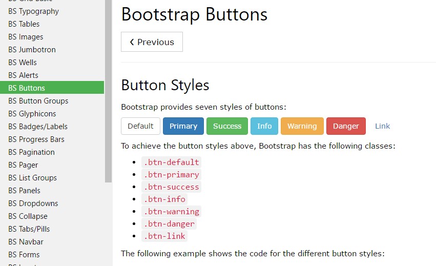
The semantic classes are the same in number as in the latest version but with some improvements-- the hardly ever used default Bootstrap Button Icon generally coming with no meaning has been dismissed in order to get replaced by the even more intuitive and subtle secondary button styling so presently the semantic classes are:
Primary .btn-primary - colored in soft blue;
Secondary .btn-secondary - replacing the .btn-default class-- pure white color tone with subtle grey outline; Info .btn-info - a bit lighter and friendlier blue;
Success .btn-success the good old green;
Warning .btn-warning colored in orange;
Danger .btn-danger which happens to be red;
And Link .btn-link that comes to design the button as the default hyperlink element;
Just make sure you first incorporate the main .btn class before applying them.

<button type="button" class="btn btn-primary">Primary</button>

<button type="button" class="btn btn-secondary">Secondary</button>

<button type="button" class="btn btn-success">Success</button>

<button type="button" class="btn btn-info">Info</button>

<button type="button" class="btn btn-warning">Warning</button>

<button type="button" class="btn btn-danger">Danger</button>

<button type="button" class="btn btn-link">Link</button>
Tags of the Bootstrap buttons
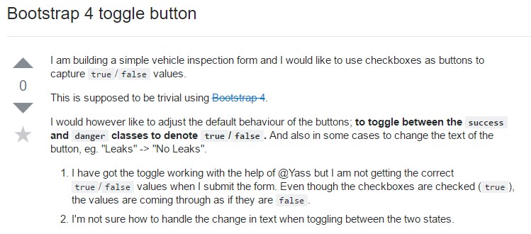
The .btn classes are created for being used together with the <button> element. You can also use these classes on <a> or <input> elements (though some browsers may apply a relatively different rendering). When applying button classes on <a> elements which are used to provide in-page functions (like collapsing content), rather than relating to new web pages or parts inside the existing webpage, these hyperlinks should be given a role="button" to properly convey their purpose to assistive technologies such as display screen viewers.
<a class="btn btn-primary" href="#" role="button">Link</a>
<button class="btn btn-primary" type="submit">Button</button>
<input class="btn btn-primary" type="button" value="Input">
<input class="btn btn-primary" type="submit" value="Submit">
<input class="btn btn-primary" type="reset" value="Reset">
These are however the fifty percent of the practical looks you can put into your buttons in Bootstrap 4 due to the fact that the new version of the framework at the same time gives us a new slight and beautiful manner to design our buttons helping keep the semantic we already have-- the outline process.
The outline Bootstrap button
The pure background with no border gets replaced by an outline along with some text with the corresponding color. Refining the classes is certainly simple-- just provide outline just before assigning the right semantics like:
Outlined Primary button comes to be .btn-outline-primary
Outlined Additional - .btn-outline-secondary and so on.
Necessary fact to note here is there actually is no such thing as outlined hyperlink button and so the outlined buttons are actually six, not seven .
Change the default modifier classes with the .btn-outline-* ones to remove all of the background pics and color tones on any kind of button.
<button type="button" class="btn btn-outline-primary">Primary</button>
<button type="button" class="btn btn-outline-secondary">Secondary</button>
<button type="button" class="btn btn-outline-success">Success</button>
<button type="button" class="btn btn-outline-info">Info</button>
<button type="button" class="btn btn-outline-warning">Warning</button>
<button type="button" class="btn btn-outline-danger">Danger</button>
Additional text message in Bootstrap button
The Bootstrap button classes and outlined appearances are really great it is important to remember some of the page's visitors won't actually be able to see them so if you do have some a bit more special meaning you would like to add to your buttons-- make sure along with the visual means you also add a few words describing this to the screen readers hiding them from the page with the . sr-only class so actually anybody might get the impression you want.
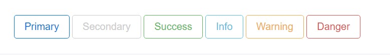
Buttons scale
<button type="button" class="btn btn-primary btn-lg">Large button</button>
<button type="button" class="btn btn-secondary btn-lg">Large button</button>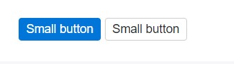
<button type="button" class="btn btn-primary btn-sm">Small button</button>
<button type="button" class="btn btn-secondary btn-sm">Small button</button>
Write block level buttons-- those that span the full width of a parent-- by adding .btn-block.
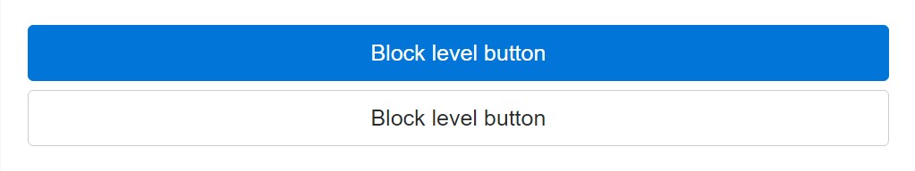
<button type="button" class="btn btn-primary btn-lg btn-block">Block level button</button>
<button type="button" class="btn btn-secondary btn-lg btn-block">Block level button</button>
Bootstrap buttons active setting
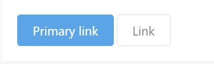
Buttons are going to show up pressed ( by using a darker background, darker border, and inset shadow) while active. There's no need to add a class to <button>-s as they work with a pseudo-class. Though, you can absolutely still force the same active look with . active (and include the aria-pressed="true" attribute) should you need to replicate the state programmatically.
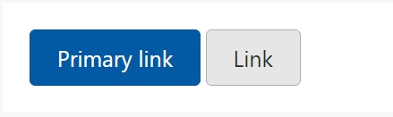
<a href="#" class="btn btn-primary btn-lg active" role="button" aria-pressed="true">Primary link</a>
<a href="#" class="btn btn-secondary btn-lg active" role="button" aria-pressed="true">Link</a>
Bootstrap button disabled mode
Force buttons seem out of service through adding the disabled boolean attribute to any type of <button> element.
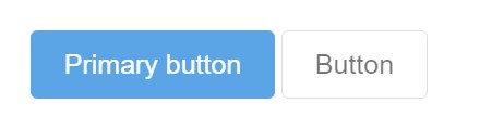
<button type="button" class="btn btn-lg btn-primary" disabled>Primary button</button>
<button type="button" class="btn btn-secondary btn-lg" disabled>Button</button>
Disabled buttons making use of the <a> element behave a little different:
- <a>-s do not support the disabled feature, in this degree you will need to add in the .disabled class to get it visually appear disabled.
- A few future-friendly styles are featured to disable every one of pointer-events on anchor buttons. In internet browsers which assist that property, you will not notice the disabled pointer at all.
- Disabled buttons really should incorporate the aria-disabled="true" attribute to signify the condition of the component to assistive technologies.
<a href="#" class="btn btn-primary btn-lg disabled" role="button" aria-disabled="true">Primary link</a>
<a href="#" class="btn btn-secondary btn-lg disabled" role="button" aria-disabled="true">Link</a>
Link usefulness caveat
In addition, even in browsers that do support pointer-events: none, keyboard navigation remains unaffected, meaning that sighted keyboard users and users of assistive technologies will still be able to activate these links.
Bootstrap button toggle
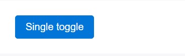
<button type="button" class="btn btn-primary" data-toggle="button" aria-pressed="false" autocomplete="off">
  Single toggle
</button>
A bit more bootstrap buttons: checkbox and even radio
The checked status for these types of buttons is only upgraded with click event on the button. If you put to use an additional solution to modify the input-- e.g., with <input type="reset"> or simply by manually applying the input's checked property-- you'll will need to toggle .active on the <label> manually.
Bear in mind that pre-checked buttons need you to manually put in the .active class to the input's <label>.
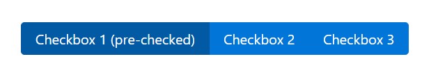
<div class="btn-group" data-toggle="buttons">
  <label class="btn btn-primary active">
    <input type="checkbox" checked autocomplete="off"> Checkbox 1 (pre-checked)
  </label>
  <label class="btn btn-primary">
    <input type="checkbox" autocomplete="off"> Checkbox 2
  </label>
  <label class="btn btn-primary">
    <input type="checkbox" autocomplete="off"> Checkbox 3
  </label>
</div>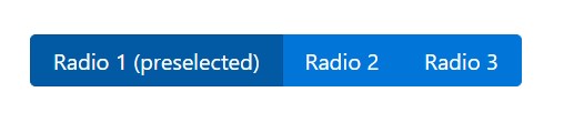
<div class="btn-group" data-toggle="buttons">
  <label class="btn btn-primary active">
    <input type="radio" name="options" id="option1" autocomplete="off" checked> Radio 1 (preselected)
  </label>
  <label class="btn btn-primary">
    <input type="radio" name="options" id="option2" autocomplete="off"> Radio 2
  </label>
  <label class="btn btn-primary">
    <input type="radio" name="options" id="option3" autocomplete="off"> Radio 3
  </label>
</div>
Techniques
$().button('toggle') - toggles push condition. Brings the button the look that it has been activated.
Conclusions
Generally in the new version of the most popular mobile first framework the buttons evolved aiming to become more legible, more easy and friendly to use on smaller screen and much more powerful in expressive means with the brand new outlined appearance. Now all they need is to be placed in your next great page.
Check a couple of youtube video tutorials about Bootstrap buttons
Related topics:
Bootstrap buttons authoritative documents
W3schools:Bootstrap buttons tutorial
Bootstrap Toggle button